
SWELLには標準搭載、SANGOだとぽんひろさんのカスタマイズでできる追従目次ボタン。
このカスタマイズを他のテーマでも使えないか模索してみました。
本記事の紹介するカスタマイズは、ぽんひろさんのカスタマイズをさらにカスタマイズしたものになります。
デモページ
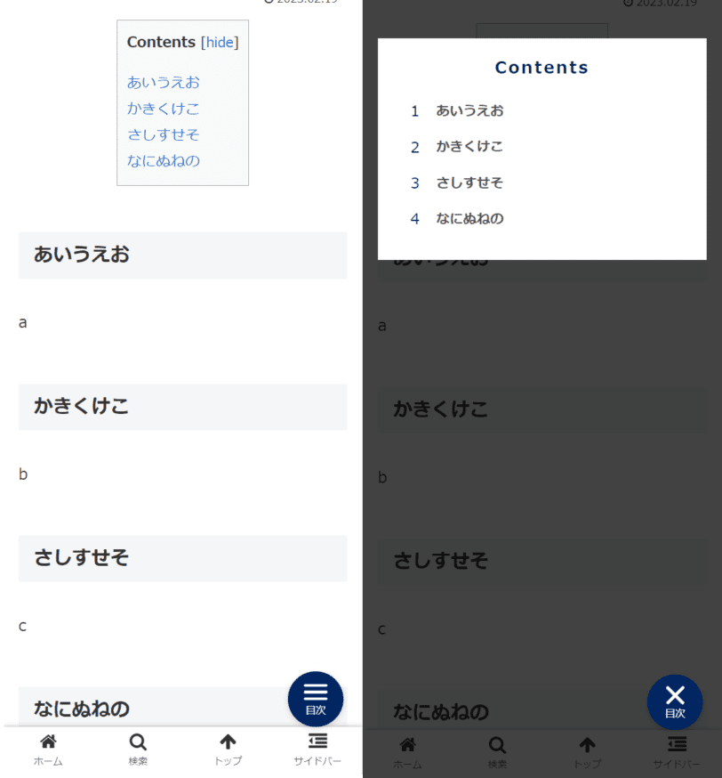
ぽんひろさんのカスタマイズと違う点は以下になります。
- 目次部分だけのダイアログ表示
- 目次部分の外をタップすると閉じる
- FTPを使って追加のJSファイルを追加しないでJavascriptを記述、簡単設定に。
WordPressの追従目次ボタンのカスタマイズ
基本的にはぽんひろさんのカスタマイズと同じです。
いくつかコードが追加しています。
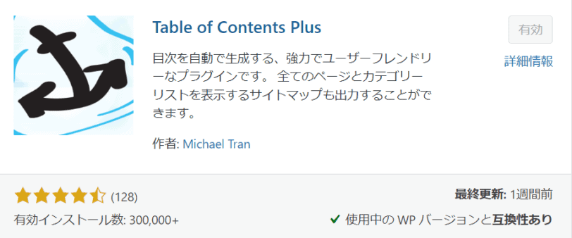
Table of Contents Plusで検索してプラグインを導入します。
設定はお好みで大丈夫です。
今回は以下の設定にしています。
- Number list itemsのチェックを外す
- Enable smooth scroll effectにチェック
- Smooth scroll top offset を70px
外観 > テーマエディタ > functions.phpにPHPのコードを挿入します。
WordPressのエラーが怖い人はCode Snippetsをいれてあげましょう。
add_action(
'widgets_init',
function(){
register_sidebar(array(
'id' => 'mobile_toc_widget',
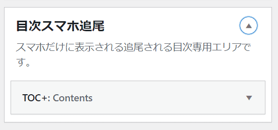
'name' => '目次スマホ追尾',
'description' => 'スマホだけに表示される追尾される目次専用エリアです。',
'before_widget' => '',
'after_widget' => '',
'before_title' => '<div class="widgettitle">',
'after_title' => "</div>\n"
));
}
);
function foot_customtags() {
if ( wp_is_mobile() && is_single()) :
if(is_active_sidebar('mobile_toc_widget')) :
echo <<<EOM
<div id="mobile-toc-widget-wrap">
<label for="mobile-toc">
<div class="mobile-toc-button">
<div class="menu-trigger">
<span></span>
<span></span>
<span></span>
</div>
<span class="mobile-toc-button-title">目次</span>
</div>
</label>
<input type="checkbox" id="mobile-toc"/>
<div class="mobile-toc-show">
<div class="mobile-toc-widget">
EOM;
dynamic_sidebar('mobile_toc_widget');
echo <<<EOM
</div>
</div>
</div>
EOM;
endif;
endif;
}
add_action( 'wp_footer', 'foot_customtags' );テーマによってはif文が上手く作用せず、目次ボタンが表示されないことがあるようです。
その場合はコメントアウトしましょう。
//if ( wp_is_mobile() && is_single()) :
//if(is_active_sidebar(‘mobile_toc_widget’)) :
//endif;
//endif;
外観 > テーマエディタ > functions.phpにJSのコードを挿入します。
WordPressのエラーが怖い人はCode Snippetsをいれてあげましょう。
add_action('wp_footer', function () { ?>
    <script>
        document.addEventListener('DOMContentLoaded', () => {
                    jQuery('#mobile-toc-widget-wrap label').on('click', function() {
                        jQuery('.menu-trigger').toggleClass('active');
                    });
                    jQuery('#mobile-toc-widget-wrap .toc_widget_list a').on('click', function() {
                        jQuery('.menu-trigger').toggleClass('active');
                    });
                    jQuery('#drawer__input').on('click', function() {
                        if (jQuery('#drawer__input').prop('checked')) {
                            jQuery('#mobile-toc-widget-wrap').css('display', 'none');
                        } else {
                            jQuery('#mobile-toc-widget-wrap').css('display', 'block');
                        }
                    });
                    jQuery('#mobile-toc-widget-wrap .toc_widget_list a').click(function() {
                        if (jQuery('#mobile-toc-widget-wrap input').prop('checked')) {
                            jQuery('#mobile-toc-widget-wrap input').prop('checked', false);
                        }
                    });
                    jQuery(function() {
                        var headerHight = 50;
                        jQuery('a[href^="#"]').click(function() {
                            var href = jQuery(this).attr("href");
                            var target = jQuery(href == "#" || href == "" ? 'html' : href);
                            var position = target.offset().top - headerHight;
                            jQuery("html, body").animate({
                                scrollTop: position
                            }, 550, "swing");
                            return false;
                        });
                    });
						jQuery(document).on('click', function(e) {
							jQuery('.mobile-toc-show' ).click( function(){
								if (jQuery('#mobile-toc-widget-wrap input').prop('checked')) {
									jQuery('#mobile-toc-widget-wrap input').prop('checked', false);
								}
								jQuery('.menu-trigger').toggleClass('active');
							  } );
							jQuery('.mobile-toc-widget' ).on( 'click', function( e ){
								e.stopPropagation();
							  } );
						});
                    });
    </script>
<?php });
目次部分をクリックすると閉じないように記述しています。
jQuery(‘.mobile-toc-widget’ ).on( ‘click’, function( e ){
e.stopPropagation();
} );
またJSをfunctions.phpに書くことで、カスタマイズの設定をしやすく変更しています。
もしボタンのJSが上手く動かないときは、ぽんひろさんのカスタマイズ通り、script.jsを子テーマ直下かに格納して読み込みスルPHPを追記しましょう。
外観 > テーマエディタ > style.cssにCSSのコードを挿入します。
もちろんカスタマイズの追加CSSでも大丈夫です。
最初の–mobile-toc-colorにベースカラーのコードを入れてください
:root {
	--mobile-toc-color: #002561;/* ベースの色 */
}

#mobile-toc-widget-wrap .menu-trigger,
#mobile-toc-widget-wrap .menu-trigger span {
    display: inline-block;
    transition: all .4s;
    box-sizing: border-box;
}
#mobile-toc-widget-wrap .menu-trigger {
    position: relative;
    width: 25px;
    height: 35px;
}
#mobile-toc-widget-wrap .menu-trigger span {
    position: absolute;
    left: 0;
    width: 100%;
    height: 3px;
    background-color: #fff;
    border-radius: 4px;
}
#mobile-toc-widget-wrap .menu-trigger span:nth-of-type(1) {
    top: 13px;
}
#mobile-toc-widget-wrap .menu-trigger span:nth-of-type(2) {
    top: 20px;
}
#mobile-toc-widget-wrap .menu-trigger span:nth-of-type(3) {
    top: 27px;
}
#mobile-toc-widget-wrap .menu-trigger.active {
    -webkit-transform: rotate(360deg);
    transform: rotate(360deg);
}
#mobile-toc-widget-wrap .menu-trigger.active span:nth-of-type(1) {
    -webkit-transform: translateY(20px) rotate(-45deg);
    transform: translateY(20px) rotate(-45deg);
    top:0;
}
#mobile-toc-widget-wrap .menu-trigger.active span:nth-of-type(2) {
    -webkit-transform: translateY(0) rotate(45deg);
    transform: translateY(0) rotate(45deg);
}
#mobile-toc-widget-wrap .menu-trigger.active span:nth-of-type(3) {
    opacity: 0;
}
#mobile-toc-widget-wrap{
    position: fixed;
    bottom: 50px;
    right: 20px;
    margin: 0;
    padding: 0;
    z-index:100;
    counter-reset: mobile-toc;
}
#mobile-toc-widget-wrap label .mobile-toc-button {
    width: 58px;
    height: 58px;
    border-radius:50%;
    background: var(--mobile-toc-color);
    box-shadow: 0px 2px 6px rgba(0, 0, 0, 0.16);
    transition: ease-out 0.3s;
    text-align:center;
    position:relative;
    z-index: 3;
}
#mobile-toc-widget-wrap label .mobile-toc-button .mobile-toc-button-title {
    color: #fff;
    font-size: 0.65em;
    letter-spacing: 0;
    position: absolute;
    bottom: 7px;
    left: 0;
    right: 0;
    margin: auto;
}
#mobile-toc-widget-wrap label:hover {
    background: #efefef;
}
#mobile-toc-widget-wrap input {
    display: none;
}
#mobile-toc-widget-wrap .mobile-toc-show {
    display:none;
}
#mobile-toc-widget-wrap input:checked ~ .mobile-toc-show {
    background:#fff;
    position: absolute;
    top: 0;
    left: 0;
    padding: 2.5em 1em;
    position:fixed;
    width:100%;
    height:100%;
    display:block;
    animation: 0.5s fade-in;
    -webkit-animation: 0.5s fade-in;
    overflow-y:scroll;
}
#mobile-toc-widget-wrap .mobile-toc-widget {
    background-color: #fff;
    padding: 1em;
}
@-webkit-keyframes fadeIn {
  0% {display: none;opacity: 0;}
  1% {display: block;opacity: 0;}
  100% {display: block;opacity: 0.93;}
}
@keyframes fade-in {
  0% {display: none;opacity: 0;}
  1% {display: block;opacity: 0;}
  100% {display: block;opacity: 0.93;}
}
#mobile-toc-widget-wrap .widgettitle{
    text-align: center;
    margin: 0 0 1em;
    color: var(--mobile-toc-color);
    font-size: 1.1em;
    letter-spacing:2px;
    background:none;
    font-weight:600;
}
/*スマホ追尾目次 TOC*/
#mobile-toc-widget-wrap .toc_widget_list{
    font-size:0.8em;
    padding:0 !important;
}
#mobile-toc-widget-wrap .toc_widget_list a{
    text-decoration:none;
    color:#555;
    font-weight:600;
}
#mobile-toc-widget-wrap .toc_widget_list > li {
    list-style-type: none !important;
    position: relative;
    margin-left: 13px;
    margin-right: 25px;
    padding-left: 32px;
    margin-bottom: 15px;
    padding-bottom: 0px;
    font-size: 1.1em;
    line-height: 1.6;
}
#mobile-toc-widget-wrap .toc_widget_list > li:before{
    counter-increment: mobile-toc;
    content: counter(mobile-toc);
    position: absolute;
    left: 5px;
    top: -1px;
    background: none;
    font-size: 1.1em;
    color:var(--mobile-toc-color);
}
#mobile-toc-widget-wrap .toc_widget_list > li ul {
    margin-top: 5px;
    padding-left: 20px;
    list-style:none;
}
#mobile-toc-widget-wrap .toc_widget_list > li > ul > li a {
    position: relative;
    text-decoration: none !important;
    font-weight:500;
}
#mobile-toc-widget-wrap .toc_widget_list > li ul li a:before {
    position: absolute;
    content: "・";
    font-size: 1.4em;
    left: -20px;
    top: -10px;
    color: var(--mobile-toc-color);
}
#mobile-toc-widget-wrap input:checked ~ .mobile-toc-show {
    background: #000000bd;
}
目次以外の部分の背景は透明の黒板を敷くようにしています。
最後に外観 > ウィジェットから目次スマホ追尾の項目が追加されているので
TOC+のウィジェットを追加すればOKです。
スマホの表示で確認してみましょう。
- 右下に目次ボタンが表示されていて、ボタンを押すと目次が表示されます。
- また目次の項目をクリックすると、該当の見出しまでスクロールされます。
- 目次エリア外を押す、または目次ボタンを押すと目次が閉じます
デモページ
まとめ
ぽんひろさんの追従目次ボタンのカスタマイズはとても人気のようで、今もよく使われている方を見かけます。
ダイアログ外をタップしたら閉じる等、こうしたら使い勝手がよさそうと思いコードを加筆してみました。
気になった方は是非試してみてください。