メインビジュアルに動的な要素をいれるとサイトがリッチに見えるのですが、
動画にしてしまうと、表示が重たいのと、PC環境と動画のコーデックによっては表示されないことがあります。
ですのでSVGのアニメーションもいいのですが、画像を重ねてアニメーションするのが一番シンプルなので検証してみました。
その備忘録です。
目次
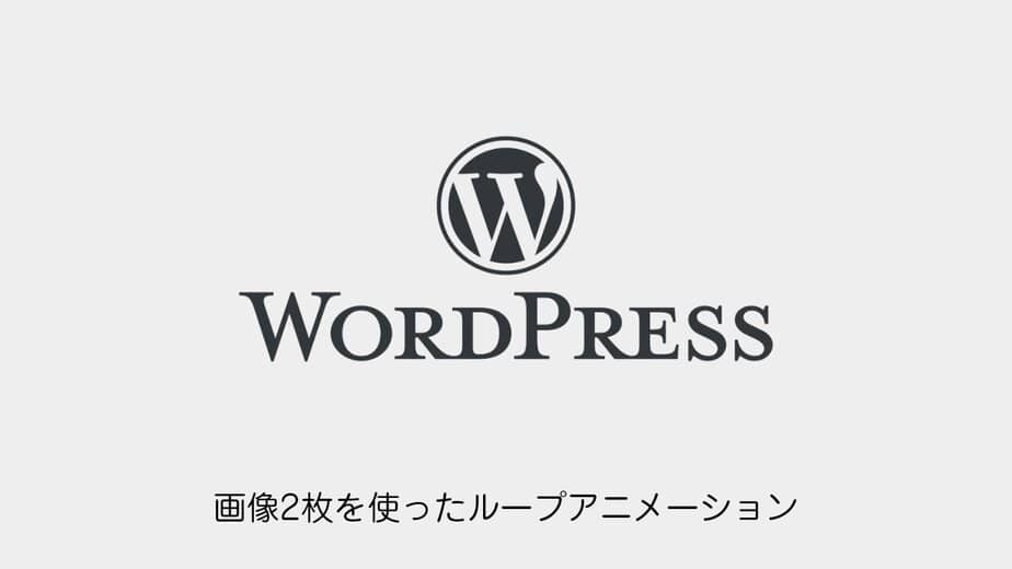
エフェクト用の画像2枚だけでループアニメーションを作成する方法
実装方法はシンプルです。
HTMLとCSSを設定するだけです。
アニメーションは回転とスケールを使用しています。
画像
下地用の画像と上に重ねる用の画像を2種類用意します。
HTML
<!-- 回転アニメーション:#loop -->
<div id="loop" class="fx-image"></div>
<!-- 拡大縮小アニメーション:#loop2 -->
<div id="loop2" class="fx-image"></div>
CSS
画像のパスを指定してあげます。
   /* 画像要素のベーススタイル */
    .fx-image {
      position: absolute;
      top: 50%;
      left: 50%;
      transform: translate(-50%, -50%);
      width: 100%;
      height: 100%;
    }

    /* ---------------------------------
       1枚目(回転アニメーション)
    ---------------------------------- */
    #loop {
      animation: rotate 80s linear infinite; /* 80秒で1回転 */
      z-index: 1;
    }
    #loop::before {
      content: "";
      position: absolute;
      width: 100%;
      height: 100%;
      background-image: url("https://motoki-design.co.jp/wordpress/wp-content/uploads/fx_image_02.png");
      background-position: center;
      background-repeat: no-repeat;
      background-size: contain;
      opacity: 0.8;
    }

    @keyframes rotate {
      0% {
        transform: translate(-50%, -50%) rotate(0deg);
      }
      100% {
        transform: translate(-50%, -50%) rotate(360deg);
      }
    }

    /* ---------------------------------
       2枚目(拡大縮小アニメーション)
    ---------------------------------- */
    #loop2 {
      animation: scaleAnime 5s ease infinite alternate;
      z-index: 2;
    }
    #loop2::before {
      content: "";
      position: absolute;
      width: 100%;
      height: 100%;
      background-image: url("https://motoki-design.co.jp/wordpress/wp-content/uploads/fx_image_01.png");
      background-position: center;
      background-repeat: no-repeat;
      background-size: contain;
      scale: 1.1;
      opacity: 0.8;
    }

    @keyframes scaleAnime {
      0% {
        transform: translate(-50%, -50%) scale(0.9);
      }
      100% {
        transform: translate(-50%, -50%) scale(1.0);
      }
    }
以上です。
あとは確認しましょう。